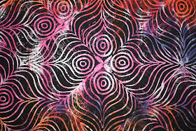
I've removed the masking tape from the edge.
I think the design created by the orientation of the printing blocks is interesting and fun.But it is a lot more interesting on a smaller scale - at least that's the case with the black ink - it looks like op art to me.
Here is a view of the entire piece. I guess this one is for learning - while I like it in many ways, I am not inspired to quilt it or finish it at this point.
I like the way this looks from within 5 feet, but when I stand back 12 feet and look at this piece - the black ink starts turning into a fuzzy blur and at 20 feet it is a washed out gray blob. It does not look like something that would draw you in from across the room. That's why I am thinking some subtle color changes in the ink would be effective.
I think it would be better if it was all one piece of fabric instead of two different background pieces - it's a lot more distracting than I thought it would be to have two fabrics seamed in the middle. To my eye, the more solid pink (top) background is more effective than the more multi-colored (bottom) fabric (this surprises me - I expected the opposite). I think if I wanted to try working this block on whole cloth again, I would use a single, more solid color piece of fabric for the background and I think I would try it with some subtle color differences in the ink. I feel that might create more visual interest.
I am also thinking it might be quite effective to print this block entirely with metallic paints on either black or white fabric . . . hmmmm,


No comments:
Post a Comment