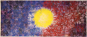
I've trimmed this piece and am now evaluating it on the design wall. I am not sure it is even worth binding.........? Maybe it is just my winter mood.
.....Still, I feel it is leaps and bounds more interesting than what I began with (below).
Or......is it better trimmed and rotated?
(I think this might be better if I can even up the blue printing so the color shift lines up horizontally on either side of the yellow circle). What do you think?


I like the vertical orientation. How about turning it 180? Thanks for sharing your design process.
ReplyDeleteI like the vertical orientation. How about turning it 180? Thanks for sharing your design process.
ReplyDeleteI see a setting sun over a deep blue sea....
ReplyDeleteChanging the orientation & cropping makes all the difference. Once you printed so heavily obscuring the patterning of the underlying collage, only what was happening on the surface mattered. I really disliked that big overpowering yellow circle smack dab in the middle, felt you needed to tone it down, couldn't understand this piece. Now it makes sense, needs no toning or anything else really. Bind it! This has been a most informative journey for me.
ReplyDeleteYes! I love the vertical orientation.
ReplyDeleteVertical is much better.
ReplyDeleteIt's difficult to venture an opinion since I think your work is awesome, but on this one I have to agree with the Idaho Beauty, though only so far. I don't think the orientation helps. Perhaps if the yellow were toned down or overpainted, it might appeal more. I love following your process!
ReplyDelete