Here is a full image (above) of the design once all the composition is finished. The next thing to do - quilting (below). I do all my quilting at my domestic sewing machine a Juki 98Q that is a workhorse. It drives fast and has a bit of extra room between the needle and base so I can make those wide swings and swirls and spirals!
Adventures of a studio artist who works primarily with textile and mixed media art.
Friday, March 6, 2015
Thursday, March 5, 2015
Filling in with Screen Printed Turbines
The large wind turbines are fused applique, but the smaller ones are screen printed and hand painted. These needed to be added before quilting.
Wednesday, March 4, 2015
Earth Stories - Putting it Together
Here is a photo of the work in progress. The big wind turbines are fused in place and I am auditioning this hand printed black fabric for the base. Again, perhaps this will not be a collage, but rather, a whole cloth section that will be seamed to the top.
Tuesday, March 3, 2015
Screen Printing ProCon.org Commentary
It may seem obvious that white was the correct color to use for printing the text on this piece, but that was not the case at the time, from my perspective. I was out of silver, and black seemed to dark, so it had to be white - it was just a process of elimination. I hoped the different fonts and sizes of the text, etc. would result in a sort of cloud-like appearance from a distance that would take on a new meaning as the viewer would come closer.
I contemplated cutting the fabric up and collaging it, but I thought I could make that decision later, if necessary (like - if I ruined some section of the whole cloth or something like that, hey - it happens).
This last picture is the entire piece after the printing is complete. I cannot express how very relieved I was to see this on my design wall at this point. I really hoped I could proceed without ruining this big piece of fabric that I felt was very effective as it was without being cut up into a collage.....
Monday, March 2, 2015
Block Printing on Gray
The next step for the gray sky would be the block printing. I would be using hand carved printing blocks that I thought represented a windy or stormy atmosphere.....I planned to use silver Jacquard Lumiere, but alas, when I went to my shelves - I had just a small quantity of silver on hand. This product is not available in stores in Billings, Montana and I did not have time to order from Dharma or anyone else! It seemed like I might be able to stretch the silver if I mixed in some blue and purple and so that is what I did. This probably was not really a bad thing, after all. But I did use up every last drop of silver, blue and purple metallic that I had in my studio! The printing took an entire day, as the fabric was so large and I had to keep sliding it around on the worktable to get the thing done....
Oh, my, but it did get printed. Whew!
Sunday, March 1, 2015
Year of Abstract Art Exercises # 9 Black and White
Exercise 9 - working in black and white. Rough brushstrokes were called for. Instructions to begin with a black underpainting and continue with white and gray.
Saturday, February 28, 2015
Year of Study Abstract Art - Exercise 8
This is the second exercise on the use of pure color. Using only black and white, mixing the colors. It began with a black underpainting.
Friday, February 27, 2015
Flinging Paint in a Rain Shower
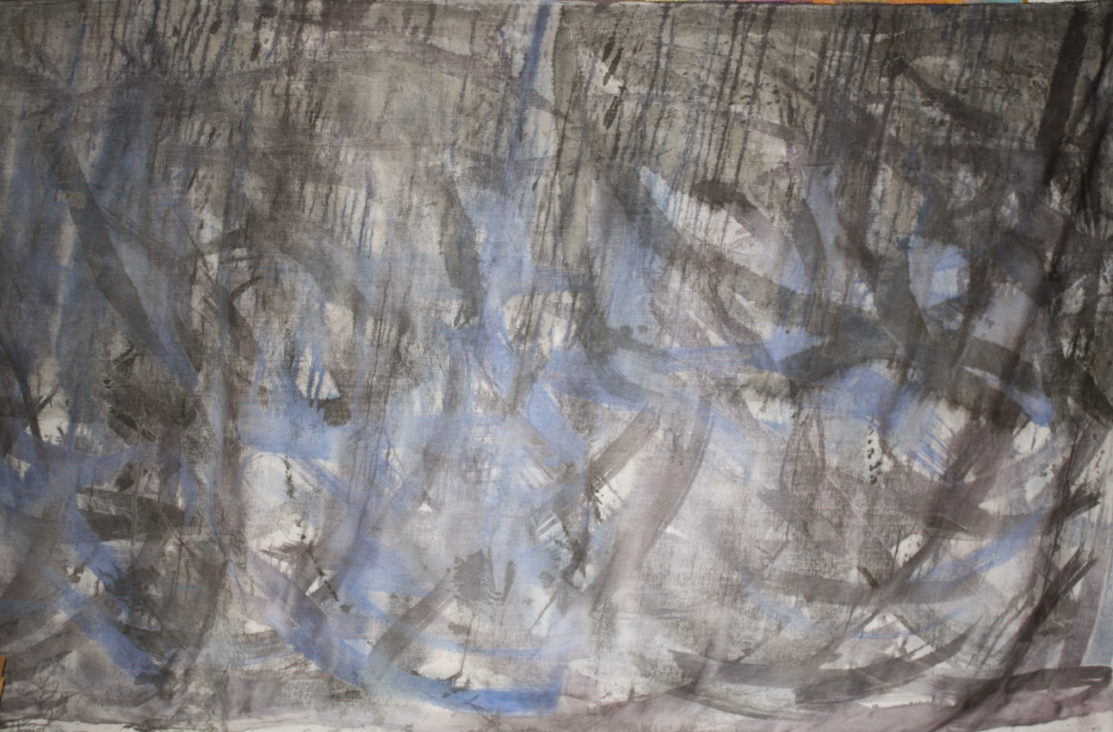
Most often, the fabrics I use in my art are carefully hand painted in a watercolor style, blending and controlling things to some extent. By the time I had decided to try a grayed color palette for my Earth Stories piece, I was down to just one month from the deadline! I had been working a full year on my other (sunset color scheme) idea. I was waiting for the rain to stop falling so I could paint a large swatch of whole cloth outdoors on the flat driveway. Alas, it rained for days and days. Flat on the driveway was just not going to cut it. Desperate, I cut a 3 yard piece of 60" wide white broadcloth and mixed up some gray, grayed purple and grayed blue Setacolor Pebeo transparent paints. In a brief lull between rain showers, I hung the fabric on my clothesline and started pouring and brushing the paint on the fabric. This is not my usual style at all, and there was a bit more running and dripping than I planned on, but I really did not have time to do it again.
This last picture is a photo of the whole piece - all 100 x 60" of it! I had no idea whether or not this was a waste of my time or not. Lacking time or proper weather to try again, I moved ahead with the project, with a plan to try using this piece of fabric as a whole cloth foundation for what would come next......
Thursday, February 26, 2015
Earth Stories, A Change of Plans
As the deadline for Earth Stories approached and my piece on the wall was not pleasing me, I went to visit my parents in Central Montana. Montana skies are usually sunny, but this time - there were clouds. I was thinking deeply about my piece for Earth Stories as I drove through Judith Gap and I started thinking about changing my color scheme. I knew it would be very challenging to start from scratch, but I was starting to think it was worth a try.
Wednesday, February 25, 2015
Stymed by Sunset and Wind Turbines
Here is the giant collage on my design wall. It barely fit and it was blindingly bright. The deadline was just 6 weeks away and there was still quilting to be done. I found myself unhappy with the design. I found myself unhappy with the whole thing. I was really having a hard time getting through this piece......
Tuesday, February 24, 2015
72" Hand Painted Turbines
As I moved forward and was getting near the deadline, I painted black wind turbines on the giant sunset collage. I thought this would be the easiest way to do it.
Monday, February 23, 2015
Fossil Fabric for Earth Stories
I hand printed black cotton with gold ink and fossil Thermofax screens. I did several yards of this, too - planning to cut it up and collage it onto the bottom section of my Earth Stories Quilt. Remember - this piece is to be 72" square, finished. I needed a lot of this fabric, too. I love the graphic and striking contrast between the black and metallic gold!
Sunday, February 22, 2015
A Year of Abstract Painting Exercises - Mixing With a Palette Knife
More color blending. This time - dropping three primary colors on the page and spreading with a knife......
Saturday, February 21, 2015
A Year of Abstract Painting Exercises - Color Blending
I have finished all the exercises exploring shape and have moved on to COLOR. The instruction for this exercise is to apply large splashes of color - using two primary colors next to each other, and to experiment with blending them.
Friday, February 20, 2015
Earth Stories 72" Sunset Collage
I spent many days hand painting fabrics to look like sunsets. I had 10 yards or more for the project. I ironed fusible web onto the back of the best ones, and collaged them into a 75" wide fabric collage - all fused to a single fabric so I could work with it. Then, I began screenprinting with gold paint using my grandmother's recipes (below).
Thursday, February 19, 2015
Third Trial Wind Turbines
Wednesday, February 18, 2015
Second Trial Piece Complete - Turbines at Sunset
I am less than thrilled with this piece, but I learned a lot doing it and have more ideas about what to try next. This piece measures 19 x 19"
Tuesday, February 17, 2015
Wind Turbines Sunset - Beginning
I have decided perhaps a scene of wind turbines against a sunset might be a more interesting image (than the blue sky I did on my first trial piece), so I have decided to create a smaller piece to try out my ideas and process. Above, a hand painted sunset fabric has been block printed with a setting sun and the ground. Below, I have added some swirling prints to the sky. I am already unhappy with the color transition in the sky - not as gradual as I hoped.
I felt like the block printing on the ground was a bit too strong / graphic / abstract - I planned to overprint it with fossil screen printing and also - I wanted to balance the darker purple in the sky, so I just painted it in solid with the leftover purple from the sky. Not such a great start, here, but I will persevere.
Monday, February 16, 2015
First Trial Piece for Earth Stories
Here are some images of the first piece I created as I began working through my ideas for my Earth Stories piece. The final piece would have to be 72" square! This one is only 11 x 14".
I thought I might be using text for some of the printing, so I used what I had on hand - some Thermofax screens of my own journal plus some other language text pieces I have - I think this may be Arabic or Hindu and possibly also some Native American written language samples. This piece is not being made with any idea that it will ever leave my studio. I am just working through my ideas here......
Sunday, February 15, 2015
Painting Spontaneous Shapes - Year of Abstract Painting Exercises
As I mentioned last week, the guide book, Painting Abstracts by Rolina van Vliet offers suggestions for further study. The first one I did - I worked from dark to light. This time, I did the reverse, building the colors on the paper from light to dark. I used iridescent paints on the underpainting (above), then added darker colors over the top (below) .
I was not so thrilled with the result, so I went back in again with lighter colors (iridescent) mixing in with the darker colors of paint.
It seems a lot more spontaneous with that final reflective layer of paint added. A final image below:
I was not so thrilled with the result, so I went back in again with lighter colors (iridescent) mixing in with the darker colors of paint.
It seems a lot more spontaneous with that final reflective layer of paint added. A final image below:
Subscribe to:
Posts (Atom)


.jpg)